Sweetgum Fall Color (#2)
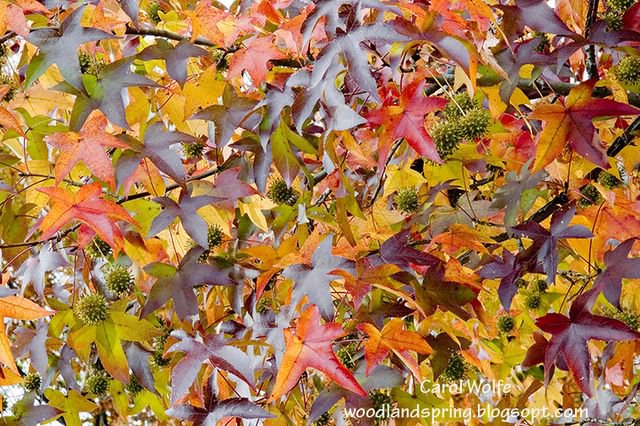
Sweetgum Branches, Nov. 8, 2005
I was not quite pleased with the colors of the previous version of this image, so I decided to try again. The difference may be subtle, but I like the fact that this second image appears a little bit warmer and a little brighter. I avoided adding too much color saturation here, and I also tried to reduce a little bit of the blue.
People with calibrated monitors are in a better position to compare these two images and judge them. Before I calibrated my monitor, all my pictures had a blue-green hue that I never really noticed. But after calibrating (using Spyder software), I realized that my monitor had been mis-representing colors. This also explained why my prints seemed to appear pinkish. As I adjusted my images on the monitor, prior to printing, I always added a bit too much pinkish color to compensate for the greenish hue of the monitor. Of course I did not realize this was happening, but I did often get frustrated by the fact that my images looked ok in the monitor, but pinkish when printed. Now that I have a calibrated monitor, I have many fewer problems in getting my print to match the image on my screen.
posted by Carol at 1:15 PM
![]()
![]()

0 Comments:
Post a Comment
<< Home